Configure Responsive Slider Module
After you finish adding the module on a page, you can click “Management Center” and enter following page.
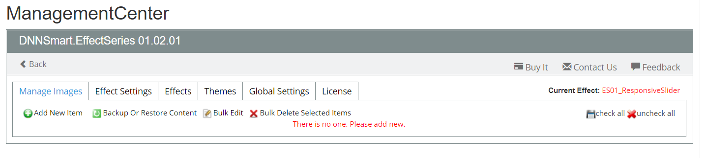
1.Manage Items
On this page, you can add, delete or edit items which are included in the slider.
For each option, we have clarifications as below.
Add New Item: After clicking this option, you can add new item.
Backup Or Restore Content: Through this option, you can export & import contents from this slider module to another one.
Bulk Edit: Through this option, you can edit all items added in the slider at the same time.
Bulk Delete Selected Items: Through this option, you can delete selected items at one time.
check all: After clicking this button, all items will be checked.
Uncheck all: After clicking this button, all items will be unchecked.
How to add a new item included in the slider?
After clicking “Add New Item” button, you will enter following page.
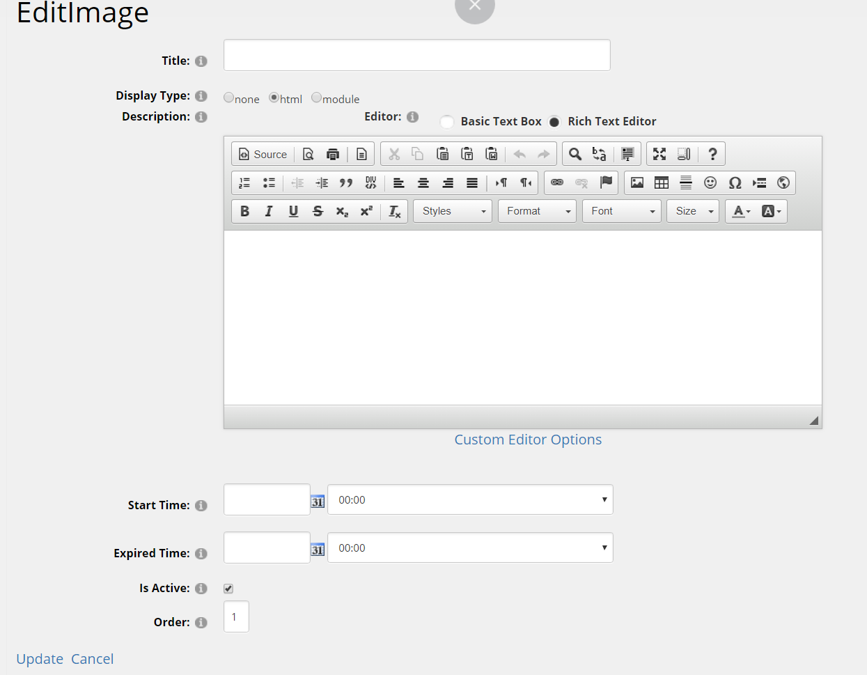
Title: It’s the title of this item, please fill in one title.
Display Type: Please choose a display type. In default, html mode will be selected and you can fill in html code. You can also choose “module”, then it can load another module.
Description: In this section, you can edit content of the item through HTML code. For example, it can be just one image, pure text or combination of text and image.
Start Time: You can configure start time of this item, then this item will start to display at that time.
Expiration time: You can configure expiration time of this item, then this item will expire and disappear at that time.
Is Active: If you uncheck this option, this item won’t display in the front-end, but it still exists in the management list.
Order: You can configure the order of this item.
3.Effect Settings
On this page, you can configure the effect of slider.
Auto Play: If this option is unchecked, slider won’t play automatically and users can only manually click different items to slide.
Delay: In AutoPlay mode, you can configure how long it will take to switch between two different items.
Animation: When switching between two different items, there are two kinds of animation effects to apply.
Animation Time: You can configure how long the slideshow transition takes.
Show Play&Pause Button: After checking this option, “Play” & “Pause” button will display in the slider.
Build Bullets: If this option is checked, bullets will display in the front-end. After clicking bullets, it will navigate to the corresponding item.
Build Arrows: If this option is checked, the forward and backward arrows will show.
Pause On Hover: In autoplay mode, the transition will pause on hover if this option is checked.
Enable Touch: If this option is checked, it will allow touching swipe navigation of the slider on touch-enabled devices.
Theme List: Themes of current effect will list here.
Theme Preview: Preview of the theme is displayed here.
Theme Style Sheet: The style sheet of current theme is included here.
4.Themes
On this page, you can upload a new theme which is customized by yourself. Then it will give your slider a new look and feel.